Information Architecture
Timeline
6 weeks
Role
Lead UX Researcher
Goal
Improve findability in our application.
At IBM, our main focus was to build a single platform that brings together multiple web applications into a single “one-stop-shop”. This was meant to unify the user experience for our B2B business partners.
At the start of this project, many of the applications were brought into a single portal without consideration of the structural design of the platform. This meant that the information architecture (IA) of the Web App was becoming increasingly disjointed and complex to navigate for our business partners (users). This problem presented a research opportunity to identify existing navigational issues and establish a new information architecture that can serve as a single reference point (a map of sorts) for our product teams.
Team
UX Designers in my business unit were working on transforming the entire platform into IBM's Carbon for Salesforce Design System (C4S). The design team were struggling to accommodate the numerous tabs in the main navigation.
Building on this pain point, I was able to showcase the impact research could make in improving the navigation of the Web App. After getting the buy-in of my key stakeholders, together we made a business case for research to be done on the IA of the platform so that we could establish a new carbonised level-1 and level-2 navigation.


Research Objectives
The target outcome was to establish a new tree model for the IA so that we have a strong structural base for the platform.
1
Identify pain points
What are the existing pain points for our users with regard to navigating the Partner Portal? What do users have difficulty finding?
2
Improve findability
What are users’ mental models around completing certain tasks? What are the overarching goals people are trying to achieve with these tasks?
3
Inform content
design decisions
Which terminology is outdated, and how do users refer to certain parts of the experience? What are the most commonly used terms?
Challenges
Information Silo: There were 15 product squads working on the experience. Knowledge of existing pain points was scattered around these teams.
Tight timeline: Due to dependencies and pre-determined timelines, research had only 6 weeks to present user insights back to the team
“Our users have to navigate through so many different tabs to complete the same task, it's very confusing and time-consuming”
Participant 1
Card Sorting
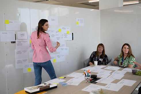
The research was kicked off with a card-sorting exercise to gather knowledge from internal stakeholders on existing pain points.
It included a small discussion group "guerilla" style with subject-matter experts such as designers, content designers, developers, business analysts, support staff & whoever wanted to join.
The goal of this study was to replace an infrastructure which wasn’t fit for purpose. Therefore, I chose an open-card sorting method, because in contrast to closed-card sorts, in open-card sorts there are no pre-established groups. Moreover, the group setting allowed us to bring together information/insights that were available to us internally.
Participant Recruitment
Given the time constraints, we had to gather information internally quickly. Participants were recruited guerilla-style during a site event in the IBM London office. The card sort took place in a group setting allowing me to bring together information/insights that were available to us internally.
Task
Participants were given a deck of 50 cards with no pre-established groups and were asked to sort them into groups, then organise the groups using a tree framework. Once they have sorted the cards as they saw fit – they were asked to explain why they chose the groups they chose.
Analysis
Thematic analysis of the data took place, focusing on finding relationships between pain points and building out a hypothesis on potential changes that needed to be made on the IA. I established a list of debated points and questions that came out of the card-sorting exercise.
Additionally, a novel information architecture model rooted in a tree structure was constructed. The next step was to validate its effectiveness through rigorous UX tree testing.


Tree testing
Conducted a combination of moderated tree tests and semi-structured interviews with 6 end-users to gain an understanding of user perception of the proposed navigation.
My goal was to observe how well users can navigate the new IA;
understand if users find information easily and quickly; and identify which menu groups and labels may be misleading.
Tree testing is a suitable method for evaluating the findability and navigability of new structural designs for applications, therefore this method was chosen to evaluate the new IA that came out of the card-sorting session. By presenting participants with a simplified representation of the architecture in the form of a tree diagram, tree testing allowed me to isolate and assess the effectiveness of the structure itself, without distractions from visual design or aesthetics.
Participant Recruitment
I defined a participant sample of 6 users through a stratified sampling method where I drew a representative sample from every group (user persona) that was needed for the study. This sampling method ensured that we had a small yet representative sample of our user population (Sauro & Lewis, 2016).
Task
Users were asked to complete 6 different actions by navigating a tree diagram. This was followed by in-depth questions about different navigation elements to understand the "why's.
Analysis
I set out to measure directness, success rate, first click, and destination for each task that users were completing. I compared user journeys against these metrics to see which tasks were most difficult to complete and which information was hardest to find.
In an addition, I conducted a workshop with my cross-functional team to map the qualitative insights against the above metrics so that we understand the "full picture" through telling the story about users' yourney
Impact & Business Outcomes
My definition of impact is... the knowledge generated by UX research influences another person, organization, product, or strategy.
Development time saved
A strong foundation was created for the new carbonised experience, thus avoiding re-works at a later point.
75% of recommendations were actioned
People felt the research was theirs and worked hard to base their decisions on it.
Increased research requests from squads
The silo between research & other disciplines was broken to increase transparency. The results? Excitement!
Growing research team
Request from stakeholders to grow the research team so that they can help more teams and accommodate demand.
Solid foundation
We now have a solid foundation to build on, which will ultimately lead to a better user experience.
Executive buy-in
Our insights helped multiple teams to prioritise different initiatives that had no buy-in from leadership before.
Reflection & Key Learnings
Tooling
I would find a different tool/software (e.g. Maze) for the tree-testing exercise. Usertesting.com tree-testing tool was problematic and our Figma alternative wasn’t seamless either.
Success Metrics
I would think more about how to define success metrics to measure each goal/objective.
Break the rules (sometimes)!
In applied research we are constrained by budgets, timelines and user participation but products still must ship, so we make the best decisions we can given the data we are able to collect.